11th July 2025 - 8 mins read
Why are TikTok carousels so popular, and how can brands use them?
Carousels on TikTok aren’t new, but they’re finally having their main character moment.
You’ve seen them: slides with messy screenshots, punchy text, chaotic memes, or quiet photo stories. They feel like peeking into someone’s camera roll or diary. And that’s exactly why people love them.
It’s low effort to make, low pressure to consume, and strangely high reward for brands, if they’re done the right way.
Carousels that really perform don’t look like ads. They look like something a real person made on a random Tuesday night. Which is why brands trying to DIY these are usually missing the mark. This format belongs in the hands of creators who know how to make it feel... real.
.jpg)
Why carousels work so well on TikTok
Carousels are different from videos. They’re less about showing off and more about storytelling -like little zines tucked into a feed full of noise. That’s why they’re resonating right now.
More slides = more story.
You’re not cramming a plot, tip, or joke into 8 seconds. You’ve got room. Room for suspense, humor, drama, or value. And when people get invested, they stay longer.
They feel like something a friend would post.
Carousels aren’t trying to go viral. They’re honest, laid-back, and sometimes chaotic. And that’s why people trust them. They don’t scream “ad,” even when they technically are.
Each slide gives you a reason to keep going.
A plot twist. A final reveal. A punchline that only lands if you make it to the end. This pacing makes carousels naturally bingeable, even when the content is super simple.
TikTok notices when people don’t scroll past.
Swipe-throughs, saves, re-watches, all of it feeds the algorithm. A good carousel doesn’t just get seen. It gets pushed.
Why are creators better for carousel posts?
This one’s for the brands still trying to design their way into relevance, pause. If your carousel feels like it came from Canva Pro and not from someone’s actual camera roll, it’s missing the point. Let the creators drive.
Creators weave stories that pull people in.
Brands often focus on features and specs. Creators focus on experiences. That shift makes a world of difference in how your product is received.
Their content doesn’t scream “ad.”
A creator’s carousel looks like it belongs. It blends into the feed with relatable language, memes, screenshots, whatever fits the story.
The placement feels natural, not forced.
Instead of opening with a logo and CTA, the product’s just... there. A part of the narrative. That makes the message stick without sounding salesy.
Trust is earned through relatability.
No one’s believing a carousel that’s too polished. Creators keep it imperfect on purpose because real is what resonates.
How to brief a creator for a good TikTok carousel
Briefing for a carousel isn’t the same as briefing for a 15-second ad. It’s slower-paced, more narrative, more “I’m telling a story to a friend” than “buy this now.” To get the best out of creators, shift your brief from structured to story-driven.
Give them a story arc, not a sales goal.
It’s not “sell this shampoo.” It’s “take us from bad hair day to confidence glow-up in 6 swipes.” Simple, but sooo much more effective.
Point them to the feelings, not just the facts.
What’s the emotional win here? Relief? Joy? Chaos-averted? That’s what guides how they shape each frame, not the ingredients list.
Let them go a little rogue (within reason).
The best stuff usually comes from off-script moments. So if your brand tone allows for it, encourage them to play with irony, edge, or even light chaos.
Drop in a few reference carousels or trends.
Don’t assume they know what you mean. Share a few examples, especially ones that got great results. A vibe board = a stronger outcome.
.jpg)
Carousel trends that are working right now
Carousel trends on TikTok are like inside jokes: you either get them or you scroll past confused. But when you do catch one, you stay. You swipe. You comment. Here are the formats creators are nailing right now, and why they keep people glued.
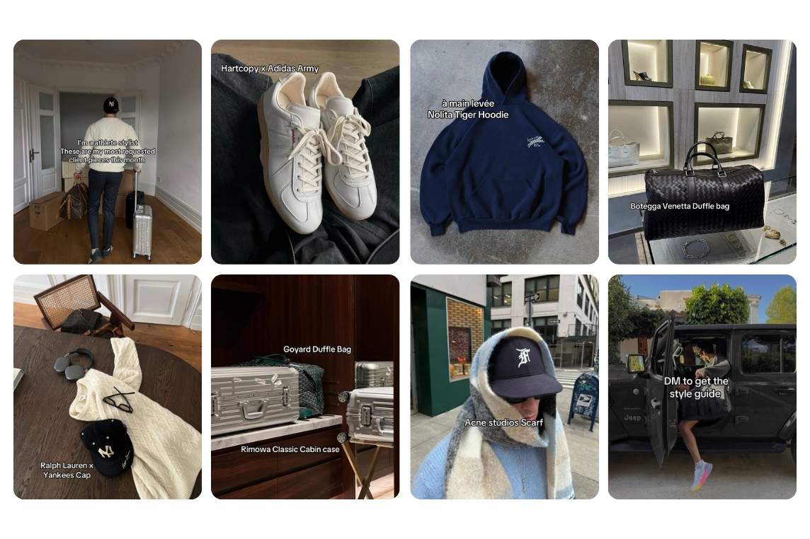
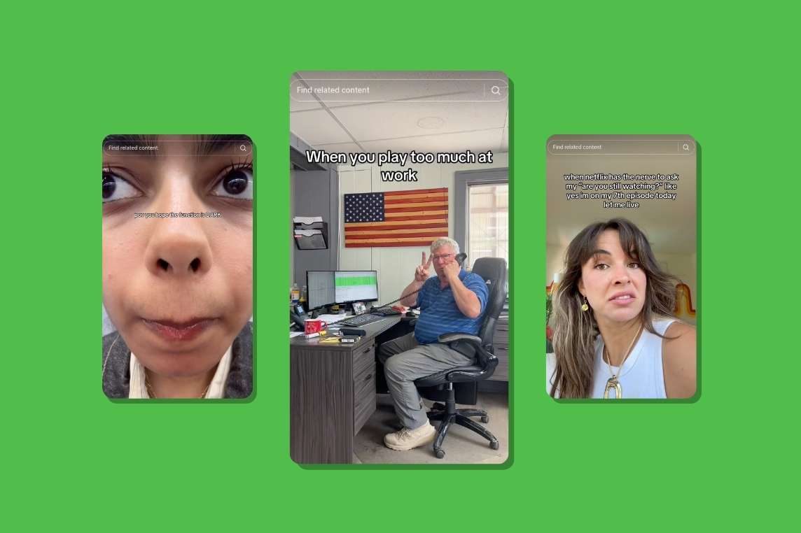
Meme storytelling with screenshots or photo dumps
These feel like stolen text convos, chaotic camera rolls, or unhinged Tumblr archives. The messiness makes them feel real, and that authenticity builds curiosity with every swipe.
Aesthetic step-by-step guides (beauty, food, lifestyle)
Think: “Get Ready With Me” but in slideshow form. These carousels are calming, often pretty, and super shareable. They teach just enough without overwhelming.
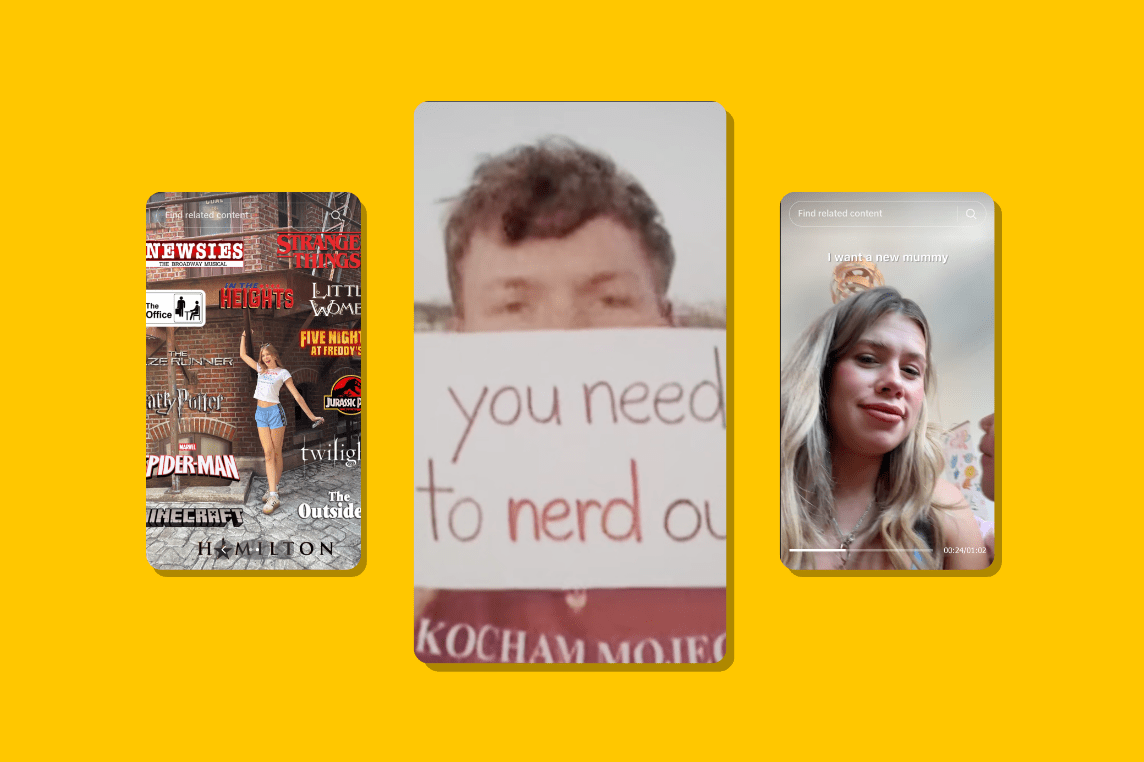
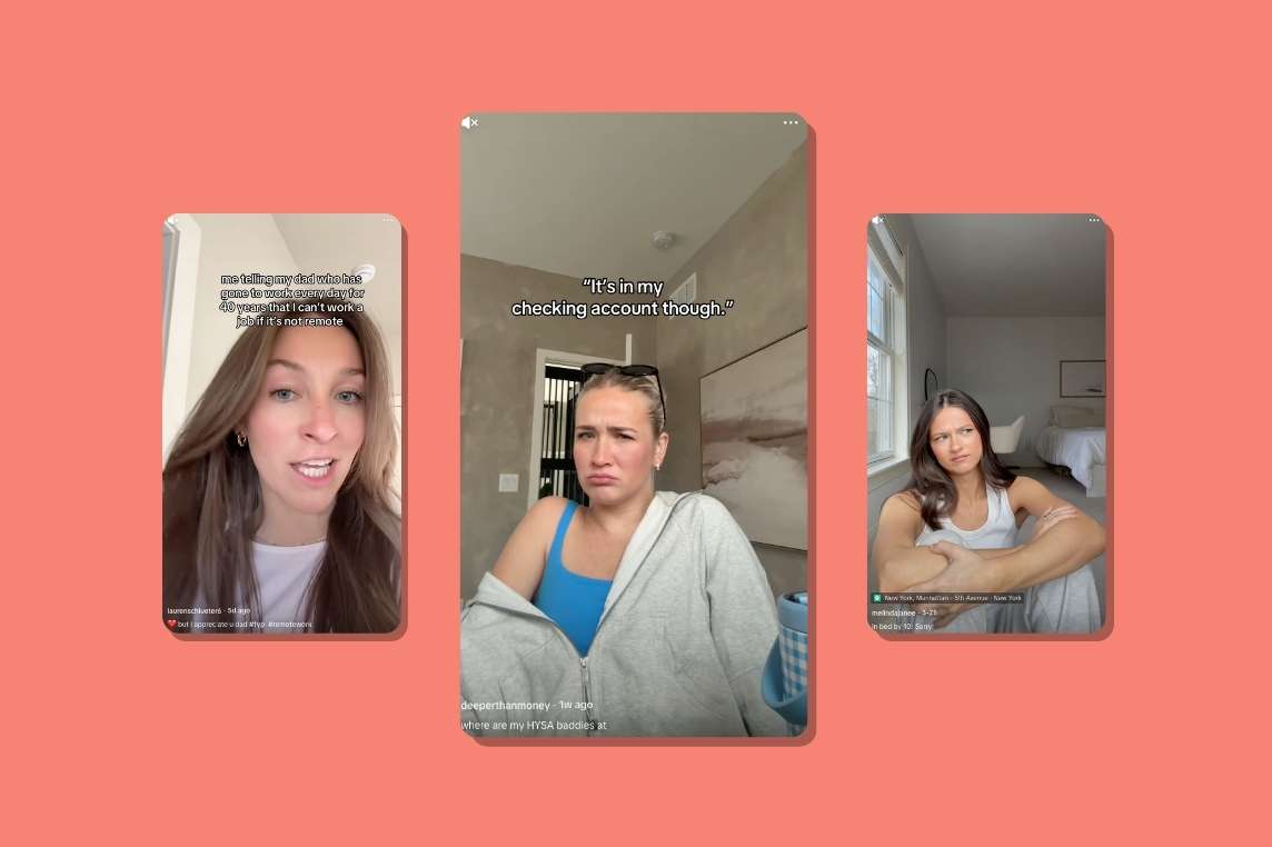
Text-led drama or cliffhangers: “Slide 5 got me crying”
It’s giving Wattpad energy. Creators tease a story like “I can’t believe what she said next” and let the audience work to reach the tea. Slide 5 always delivers.
Faceless carousels with “emotional” stories
You don’t even see the creator, but the story hits. These often feel anonymous, like diary entries. And weirdly, that makes them feel more intimate. People live in the comments.
Slideshow story carousels
Creators are structuring these like mini webtoons or graphic novels. Hook up top, suspense in the middle, satisfying or chaotic ending. Works like a charm for product placements, too, just sneak it into the plot.
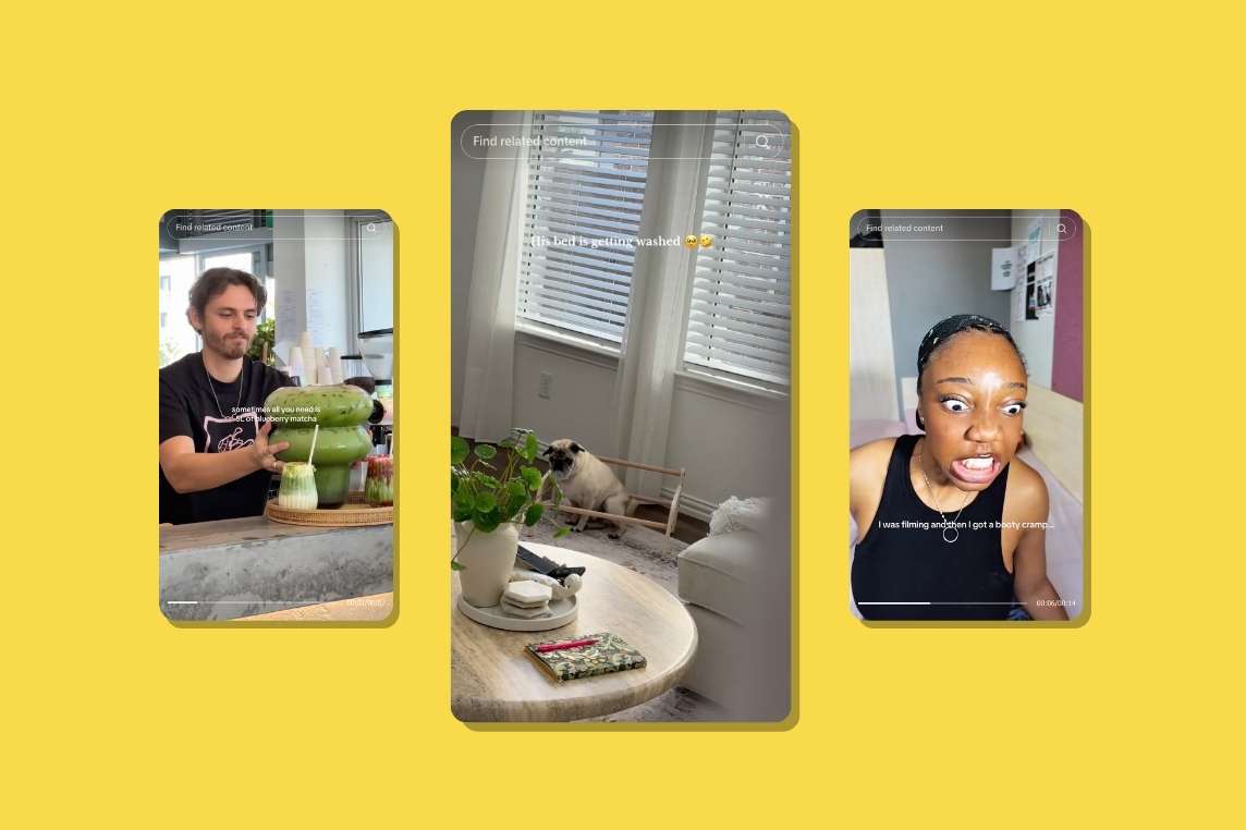
Typical UGC carousels with scroll-stopping hooks
Sometimes you don’t need plot twists, just good ol’ relatability. “Spilling the tea on my skincare budget” or “Here’s how I actually use this app in a day” draws people in because it feels like a friend oversharing.
In a nutshell
Carousels are kind of like little secrets, told one swipe at a time.
And that’s what makes people stay. They read. They react. Not because someone told them to. But because it feels like something worth staying for.
That’s why when creators lead, carousels win. Because it’s not just about “educating the customer” or “highlighting features.” It’s about building something sticky, relatable, and human.
So don’t treat carousels like slides in a pitch deck. Treat them like chapters. The story will do the rest.


%20(1).jpg)

.png)


.jpg)

.png)


.jpg)

.jpg)


.png)


.png)
.png)


